
We've released our game Headspin: Space Race. Since we enjoy reading about how other games have been made, we thought you might like to take a peek behind the scenes to see how it was built. Luke will take it from here. First, back to the beginning, with a wibbly cross fade...
The original concept
The seeds of project actually started years ago, with a pitch I designed for an animation, in the style of a popup book.

The early animation sketch, all the way from 2005
It went through a few iterations, almost becoming a client's Christmas card last year, and then, when we were discussing actually interacting with the objects, the idea of making each page symmetrical struck us. That Christmas card project never came to fruition, but we felt like we had a good idea and it also felt like a project we’d love to make. We decided to do something properly about it, and mocked up a (rather spectacular looking) prototype to see if it was fun matching symmetry.

The fabulous prototype
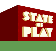
When that turned out nicely, I spent a day or so getting a 3D prototype together with block graphics to test the concept a bit more...

The first test of the book format
And once we had that, and were more convinced it was going to work, it was probably a week’s work fleshing out the prototype code into a framework for the game Headspin: Storybook, into which we could build our graphics and sound.
Headspin: Spacerace - Developing the style
We were already pretty happy with the way that Headspin: Storybook worked and thought it would work with a number of different styles. We decided to keep a similar framework, giving us the freedom to come up with all sorts of crazy sci-fi illustrations for the sequel. Here’s how we started.
My two favourite Tintin books when I was younger were always Destination Moon and Explorers on the Moon. The cover designs were a big influence. I lost my original copies, so had a few sneaky reads in bookshops recently to refresh my memory. I should just go and buy them again.

We looked at all sorts of old comics covers online, Weird Science etc, which were often beautiful, often trashy, and often very similar – each one seems to have been created with the following recipe: 1x Brave Space Ranger, 1x Damsel in Distress, 1x Slobbering Alien Monster.
These covers were from a time when comics were pretty unregulated, and some even had pretty wierd artwork (there are loads of images here if you’re interested in seeing more), in fact the ‘Approved by State of Play’ sticker in the top right of our cover is inspired by stickers they put on the later comics saying ‘Approved by the Comics Code Authority’ to reassure worried parents that little Jimmy wasn’t going to see something which would keep him awake at night.


Some of the great 1950s covers we used for inspiration
Our composition for the cover merges a lot of these different covers. It started as a pencil sketch.
![]()
First sketch for the cover
We took some photographs of us in the appropriate poses for some better reference then I drew them up onto A3 in pen. It was then taken into Photoshop and coloured, and textured with an old book cover to give it that authentic feel.
![]()
A3 version in ink
![]()
A3 version coloured
![]()
The final cover
Inspiration for the popup items in the book came from everywhere, probably from hundreds of trashy sci-fi programs I watched as a kid (Lost in Space mostly), as well as the aforementioned Tintin and 50s comic books.
Each popup illustration was drawn large, about 10cm high in each case. We knew not all the detail would appear when shrunk down to the small versions you see in the game, but knew the feel of them would remain there, and we really wanted that feel of intricacy, we wanted to encourage the feeling you want to get closer and play with this highly detailed book.
The original Headspin Storybook had about twenty small items, plus four or five different backgrounds and page designs, which we could mix and match. Space Race had at least double the number of small items, and quadruple the number of backgrounds, so it was a whole heap of illustrations to create. Kath and I set up a bit of a factory line to make the process reasonably quick. We’ve got a comfortable drawing desk in the studio and good light – one whole side of our studio roof is glass - and it turned out to be one of the most enjoyable parts of the process.
![]()
Some of the items in the game, drawn by Luke and Kath, trying to work in the same style.
From left to right, these were done by: L, K, K,L,L,K
Each of the drawings were imported into Photoshop and coloured the same way as before. For the background popups, I only had to draw half an object, since two of them match up in the middle to create a whole image, but it actually made it trickier, since things needed to look correct when brought together in the middle– rockets needed to look perfectly cylindrical for example.
Music
Space Race has an interactive score, which flows your actions, changing as you turn the page and advance the story. The first job was to decide on what I wanted it to sound like and plan the flow.
Inspiration came from a number of old sci-fi classics including Hitchhiker’s Guide to the Galaxy (did you know that was actually a proper tune by the Eagles?, 2001 (by the way, here's a spectacular example of how not to play this piece of music), Doctor Who and Lost in Space, as well as other space related music like Holst’s Planets. If you listen closely you’ll probably be able to hear shades of some of these in there. Here’s the very rough plan I noted down before I started, not extensive (or even particularly legible), but it helped me sort out the story of the music.

I then broke it down into sections and worked on small loops to fit each page of the story. Using Cubase, a
Each new section had to be in the same key and work with what had gone before it, and I needed to keep the loops down to fifteen seconds each for file size reasons. I produced dozens of different tracks before whittling them down to my favourite versions of each. The final score is comprised of around twenty fifteen-second loops, and we fade in and out of them using code when we need to.

The score as it was created in Cubase
Here’s my list of what needs to be played and when, written on what we call in the industry a Post-it Note. As you can see, when I ran out of space after level 16, rather than find another bit of paper or even a new post-it, I just stopped and thought I’d make up the rest as I went along. A pro at all times.

One thing I wanted to avoid was the music getting too samey, a big consideration for Flash games, and a sin they often commit, making you reach for the mute after just a few listens. There are only two chords used in the whole score, a risky strategy if I was going for something with variation, but I tried to keep the detail and texture of each track interesting, and to this end I made the track develop from relaxed Country n Western guitar to Majestic Horns to Eerie theremin noises in space.
It was also created to move the story forward – it contextualises your actions on each page, and provides another reason to keep advancing, to have the pleasure of hearing a story told through music.
And now a little about the actual sounds used, for any music-geeks who like to look at VST instrument panels....
Within Cubase I used the VST instruments extensively, and mostly SampleTank 2, a fine plugin which creates great sound and a lot of control. I’ve only got about a dozen instruments for it, but it lets you tweak the sound so much that you can almost make your own. For example, that ‘plink’ sound I mentioned earlier – sounds spacey and like an old synth from Dr. Who. But it’s actually a Stratocaster electric guitar, layered with a number of effects and EQed, just like this screenshot below illustrates.

SampleTank 2 within Cubase. A whole bucket of sound fiddling possibilities.
The guitar at the beginning is the only live instrument used – guitars are traditionally pretty useless as samples played on a keyboard, and in any case I wanted a laid-back ‘live’ feel. I was pretty pleased with how live the horns sound, it's great what a bit of reverb did to a reasonably dry sample.
The build
I’ve seen a few reviews of the game and its prequel Storybook which mention the game is built in 3D. In fact there’s no Papervision or Easy3D in sight, it’s all built in 2D to look 3D (even that book opening at the beginning, a somewhat crazy undertaking). In my experience, 3D engines in Flash can often look a little jagged, and, bizarrely, ‘flat’, because of the limited lighting tools, and I felt we could get a good look using 2D PNGs, tilted and skewed to look like they were on a 3D plane. It also made it a much simpler build and code from my point of view.
I’d love to make a fully 3D version in the future, it would open up other kinds of gamplay opportunities. Anything which helps us get closer to feeling like we’re dealing with real objects. If anyone out there is good with AS3 and 3D, please get in touch!
We took the opportunity to add a few improvements to the way things looked and worked in the prequel. There’s more subtle lighting on the book pages, and more detailed popup messages which tell the story between levels. We also added more pages (effectively more levels), and worked longer on testing to get the difficulty balanced as best we could.
And lo, the game was done, and now you can play it here. Enjoy!
Luke
